python中的Reportlab模块
reportlab模块是用python语言生成pdf文件的模块
安装:pip install reportlab
模块默认不支持中文,如果使用中文需要注册
1.注册中文字体
下载自己需要的.ttf字体,例如STSONG.ttf
fromreportlab.pdfbaseimportpdfmetrics
fromreportlab.pdfbase.ttfontsimportTTFont
pdfmetrics.registerFont(TTFont(‘song’, STSONG.ttf))
2.生成文字
1 2 3 4 5 6 7 8 9 10 11 12 13 14 15 16 17 18 | from reportlab.lib.styles import getSampleStyleSheetfrom reportlab.platypus import Paragraph,SimpleDocTemplatefrom reportlab.lib import colorsStyle=getSampleStyleSheet()bt = Style['Normal'] #字体的样式# bt.fontName='song' #使用的字体bt.fontSize=14 #字号bt.wordWrap = 'CJK' #该属性支持自动换行,'CJK'是中文模式换行,用于英文中会截断单词造成阅读困难,可改为'Normal'bt.firstLineIndent = 32 #该属性支持第一行开头空格bt.leading = 20 #该属性是设置行距ct=Style['Normal']# ct.fontName='song'ct.fontSize=12ct.alignment=1 #居中ct.textColor = colors.redt = Paragraph('hello',bt)pdf=SimpleDocTemplate('ppff.pdf')pdf.multiBuild([t]) |

一份pdf文件可以定义多种字体样式,如bt和ct。字体有多种属性,这里只列举一些常用的属性,
其中,
wordWrap自动换行属性的参数’CJK’是按照中文方式换行(可以在字符之间换行),英文方式为’Normal’(在空格出换行)
alignment:0 左对齐
1 居中
2 右对齐
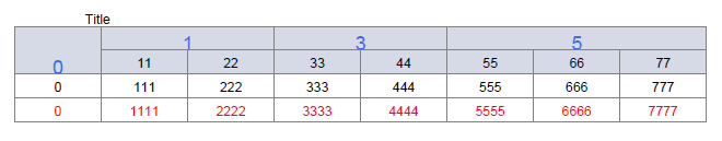
3.表格
from reportlab.platypus import Table
t = Table(data)
1 2 3 4 5 6 7 8 9 10 11 12 13 14 15 16 17 18 19 20 21 22 23 24 25 26 27 28 29 30 31 32 33 34 35 36 37 38 | from reportlab.platypus import Paragraph, SimpleDocTemplate, Table,TableStylefrom reportlab.lib.units import inchfrom reportlab.lib import colorsdef table_model(data): width = 7.2 # 总宽度 colWidths = (width / len(data[0])) * inch # 每列的宽度 dis_list = [] for x in data: # dis_list.append(map(lambda i: Paragraph('%s' % i, cn), x)) dis_list.append(x) style = [ # ('FONTNAME', (0, 0), (-1, -1), 'song'), # 字体 ('FONTSIZE', (0, 0), (-1, 0), 15), # 字体大小 ('BACKGROUND', (0, 0), (-1, 0), HexColor('#d5dae6')), # 设置第一行背景颜色 ('BACKGROUND', (0, 1), (-1, 1), HexColor('#d5dae6')), # 设置第二行背景颜色 # 合并 ('SPAN',(第一个方格的左上角坐标),(第二个方格的左上角坐标)),合并后的值为靠上一行的值,按照长方形合并 ('SPAN',(0,0),(0,1)), ('SPAN',(1,0),(2,0)), ('SPAN',(3,0),(4,0)), ('SPAN',(5,0),(7,0)), ('ALIGN', (0, 0), (-1, -1), 'CENTER'), # 对齐 ('VALIGN', (-1, 0), (-2, 0), 'MIDDLE'), # 对齐 ('LINEBEFORE', (0, 0), (0, -1), 0.1, colors.grey), # 设置表格左边线颜色为灰色,线宽为0.1 ('TEXTCOLOR', (0, 0), (-1, 0), colors.royalblue), # 设置表格内文字颜色 ('TEXTCOLOR', (0, -1), (-1, -1), colors.red), # 设置表格内文字颜色 ('GRID', (0, 0), (-1, -1), 0.5, colors.grey), # 设置表格框线为grey色,线宽为0.5 ] component_table = Table(dis_list, colWidths=colWidths,style=style) return component_tableStyle=getSampleStyleSheet()n = Style['Normal']data = [[0,1,2,3,4,5,6,7], [00,11,22,33,44,55,66,77], [000,111,222,333,444,555,666,777], [0000,1111, 2222, 3333, 4444, 5555, 6666, 7777],]z = table_model(data)pdf = MyDocTemplate('ppff.pdf')pdf.multiBuild([Paragraph('Title',n),z]) |
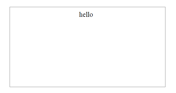
4.添加边框
from reportlab.graphics.shapes import Drawing
d = Drawing()
参数有:
d.width:边框宽度
d.heigth:边框高度
d.background:边框颜色
等等。
边框中可使用add()添加文字,图形等内容
例:
在边框中添加文字
1 2 3 4 5 6 7 8 9 10 11 12 13 14 15 16 17 18 | from reportlab.graphics.shapes import Drawing, Rectfrom reportlab.graphics.charts.textlabels import Labeldef autoLegender( title=''): width = 448 height = 230 d = Drawing(width,height) lab = Label() lab.x = 220 #x和y是文字的位置坐标 lab.y = 210 lab.setText(title) # lab.fontName = 'song' #增加对中文字体的支持 lab.fontSize = 20 d.add(lab) d.background = Rect(0,0,width,height,strokeWidth=1,strokeColor="#868686",fillColor=None) #边框颜色 return dl = autoLegender('hello')pdf=SimpleDocTemplate('ppff.pdf')pdf.multiBuild([l]) |
1 2 3 4 5 6 7 8 9 10 11 12 13 14 15 16 17 18 19 20 21 22 23 24 | # **这种方法可以给边框中的图例添加颜色说明**def autoLegender(chart, categories=[], use_colors=[], title=''): width = 448 height = 230 d = Drawing(width,height) lab = Label() lab.x = 220 #x和y是title文字的位置坐标 lab.y = 210 lab.setText(title) # lab.fontName = 'song' #增加对中文字体的支持 lab.fontSize = 20 d.add(lab) d.background = Rect(0,0,width,height,strokeWidth=1,strokeColor="#868686",fillColor=None) #边框颜色 d.add(chart) #颜色图例说明等 leg = Legend() leg.x = 500 # 说明的x轴坐标 leg.y = 0 # 说明的y轴坐标 leg.boxAnchor = 'se' # leg.strokeWidth = 4 leg.strokeColor = None leg.subCols[1].align = 'right' leg.columnMaximum = 10 # 图例说明一列最多显示的个数# leg.fontName = 'song' leg.alignment = 'right' leg.colorNamePairs = zip(use_colors, tuple(categories)) #增加颜色说明 d.add(leg) return d |
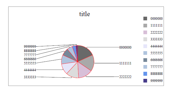
5.饼状图
饼图需要添加在边框中
1 2 3 4 5 6 7 8 9 10 11 12 13 14 15 16 17 18 19 20 21 22 23 24 25 26 27 28 29 30 31 32 33 34 35 36 37 38 39 40 41 42 43 44 45 46 47 48 49 50 51 52 53 | from reportlab.lib import colorsfrom reportlab.platypus import SimpleDocTemplatefrom reportlab.graphics.shapes import Drawing, Rectfrom reportlab.graphics.charts.textlabels import Labelfrom reportlab.graphics.charts.piecharts import Piedef autoLegender( chart,title=''): width = 448 height = 230 d = Drawing(width,height) lab = Label() lab.x = 220 #x和y是文字的位置坐标 lab.y = 210 lab.setText(title) # lab.fontName = 'song' #增加对中文字体的支持 lab.fontSize = 20 d.add(lab) d.background = Rect(0,0,width,height,strokeWidth=1,strokeColor="#868686",fillColor=None) #边框颜色 d.add(chart) return ddef draw_pie(data=[], labels=[], use_colors=[], width=360,): '''更多属性请查询reportlab.graphics.charts.piecharts.WedgeProperties''' pie = Pie() pie.x = 60 # x,y饼图在框中的坐标 pie.y = 20 pie.slices.label_boxStrokeColor = colors.white #标签边框的颜色 pie.data = data # 饼图上的数据 pie.labels = labels # 数据的标签 pie.simpleLabels = 0 # 0 标签在标注线的右侧;1 在线上边 pie.sameRadii = 1 # 0 饼图是椭圆;1 饼图是圆形 pie.slices.strokeColor = colors.red # 圆饼的边界颜色 pie.strokeWidth=1 # 圆饼周围空白区域的宽度 pie.strokeColor= colors.white # 整体饼图边界的颜色 pie.slices.label_pointer_piePad = 10 # 圆饼和标签的距离 pie.slices.label_pointer_edgePad = 25 # 标签和外边框的距离 pie.width = width pie.direction = 'clockwise' pie.pointerLabelMode = 'LeftRight' # for i in range(len(labels)): # pie.slices[i].fontName = 'song' #设置中文 for i, col in enumerate(use_colors): pie.slices[i].fillColor = col return piedata = [10,9,8,7,6,5,4,3,2,1]labs = ['0000000','1111111','2222222','3333333','4444444', '5555555','6666666','7777777','8888888','9999999']color = [HexColor("#696969"),HexColor("#A9A9A9"),HexColor("#D8BFD8"), HexColor("#DCDCDC"),HexColor('#E6E6FA'),HexColor("#B0C4DE"), HexColor("#778899"),HexColor('#B0C4DE'),HexColor("#6495ED"), HexColor("#483D8B") ]z = autoLegender(draw_pie(data,labs,color),labs,color)pdf=SimpleDocTemplate('ppff.pdf')pdf.multiBuild([z]) |
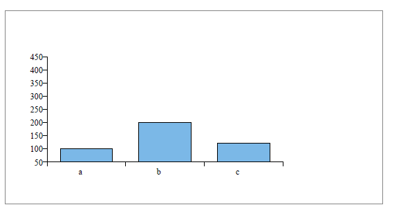
6.柱状图
柱状图需要添加在边框中
1 2 3 4 5 6 7 8 9 10 11 12 13 14 15 16 17 18 19 20 21 22 23 24 25 26 27 28 29 30 31 32 33 34 35 36 37 38 39 40 41 42 | from reportlab.graphics.charts.barcharts import VerticalBarChartfrom reportlab.lib.colors import HexColordef draw_bar_chart(min, max, x_list, data=[()], x_label_angle=0, bar_color=HexColor("#7BB8E7"), height=125, width=280): ''' :param min: 设置y轴的最小值 :param max: 设置y轴的最大值 :param x_list: x轴上的标签 :param data: y轴对应标签的值 :param x_label_angle: x轴上标签的倾斜角度 :param bar_color: 柱的颜色 可以是含有多种颜色的列表 :param height: 柱状图的高度 :param width: 柱状图的宽度 :return: ''' bc = VerticalBarChart() bc.x = 50 # x和y是柱状图在框中的坐标 bc.y = 50 bc.height = height # 柱状图的高度 bc.width = width # 柱状图的宽度 bc.data = data for j in xrange(len(x_list)): setattr(bc.bars[j], 'fillColor', bar_color) # bar_color若含有多种颜色在这里分配bar_color[j] # 调整step minv = min * 0.5 maxv = max * 1.5 maxAxis = int(height/10) # 向上取整 minStep = int((maxv-minv+maxAxis-1)/maxAxis) bc.valueAxis.valueMin = min * 0.5 #设置y轴的最小值 bc.valueAxis.valueMax = max * 1.5 #设置y轴的最大值 bc.valueAxis.valueStep = (max-min)/4 #设置y轴的最小度量单位 if bc.valueAxis.valueStep 10: for i in range(len(x_list)): tmp = '' if i%5 != 0 else x_list[i] x_real_list.append(tmp) else: x_real_list = x_list bc.categoryAxis.categoryNames = x_real_list return bcz = autoLegender(draw_bar_chart(100, 300, ['a', 'b', 'c'], [(100, 200, 120)]))pdf=SimpleDocTemplate('ppff.pdf')pdf.multiBuild([z]) |
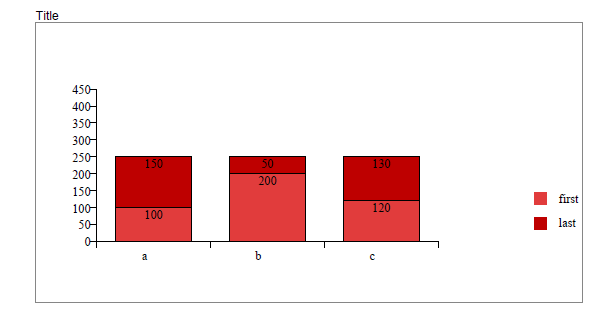
6.累加柱状图
1 2 3 4 5 6 7 8 9 10 11 12 13 14 15 16 17 18 19 20 21 22 23 24 25 26 27 28 29 30 31 32 33 34 35 36 37 38 39 40 41 42 43 44 45 46 47 48 49 50 51 52 53 54 55 | def draw_2bar_chart(min, max, x_list, data=[()],array=[()], x_label_angle=0,bar_color=[],height=125, width=280): ''' :param min: 设置y轴的最小值 :param max: 设置y轴的最大值 :param x_list: x轴上的标签 :param data: y轴对应标签的值 :param x_label_angle: x轴上标签的倾斜角度 :param bar_color: 柱的颜色 可以是含有多种颜色的列表 :param height: 柱状图的高度 :param width: 柱状图的宽度 :return: ''' bc = VerticalBarChart() bc.x = 50 # x和y是柱状图在框中的坐标 bc.y = 50 bc.height = height # 柱状图的高度 bc.width = width # 柱状图的宽度 bc.data = data # 图形柱上标注文字 bc.barLabels.nudge = -5 # 文字在图形柱的上下位置 bc.barLabelArray = array # 要添加的文字 bc.barLabelFormat = 'values' for j in xrange(len(data)): setattr(bc.bars[j], 'fillColor', bar_color[j]) # bar_color若含有多种颜色在这里分配bar_color[j] # 调整step # minv = min * 0.5 minv = 0 maxv = max * 1.5 maxAxis = int(height/10) # 向上取整 minStep = int((maxv-minv+maxAxis-1)/maxAxis) bc.valueAxis.valueMin =0 #设置y轴的最小值 bc.valueAxis.valueMax = max * 1.5 #设置y轴的最大值 bc.valueAxis.valueStep = (max-min)/4 #设置y轴的最小度量单位 if bc.valueAxis.valueStep 10: for i in range(len(x_list)): tmp = '' if i%5 != 0 else x_list[i] x_real_list.append(tmp) else: x_real_list = x_list bc.categoryAxis.categoryNames = x_real_list return bc# 制柱状图Style=getSampleStyleSheet()n = Style['Normal']my_color = [HexColor('#E13C3C'),HexColor('#BE0000')]z = autoLegender(draw_2bar_chart(100, 300, ['a', 'b', 'c'], [(100, 200, 120),(150, 50, 130)], bar_color=my_color, array=[['100','200','120'],['150','50','130']] ), categories=['first','last'], use_colors=my_color )pdf = MyDocTemplate('ppff.pdf')pdf.multiBuild([Paragraph('Title',n),z]) |
7.添加页眉
添加页眉需要我们自定义模版
1 2 3 4 5 6 7 8 9 10 11 12 13 14 15 16 17 18 19 20 21 22 23 24 25 26 27 28 29 30 31 | from reportlab.platypus.doctemplate import BaseDocTemplate, Framefrom reportlab.lib.units import cmfrom reportlab.platypus import PageTemplatefrom reportlab.lib.styles import getSampleStyleSheetimport osdef myMainPageFrame(canvas, doc): # 全局应用 "The page frame used for all PDF documents." canvas.saveState() canvas.setFont('Times-Roman', 12) pageNumber = canvas.getPageNumber() if pageNumber > 0: pic_yemei = os.path.join(os.path.dirname(__file__),'yemei01.jpg') # 页眉图片 pic_line_file = os.path.join(os.path.dirname(__file__),'line.jpg') # 页眉线 canvas.drawImage(pic_yemei, 75, 795, width=100,height=25) canvas.drawImage(pic_line_file, 75, 780, width=450, height=15) canvas.drawString(10*cm, cm, str(pageNumber)) canvas.restoreState()class MyDocTemplate(BaseDocTemplate): # 自定义模版类 "The document template used for all PDF documents." _invalidInitArgs = ('pageTemplates',) def __init__(self, filename, **kw): frame1 = Frame(2.5*cm, 2.5*cm, 15*cm, 25*cm, id='F1') self.allowSplitting = 0 BaseDocTemplate.__init__(self, filename, **kw) template = PageTemplate('normal', [frame1], myMainPageFrame) self.addPageTemplates(template) # 绑定全局应用Style=getSampleStyleSheet()n = Style['Normal']z = autoLegender(draw_bar_chart(100, 300, ['a', 'b', 'c'], [(100, 200, 120)]))pdf = MyDocTemplate('ppff.pdf')pdf.multiBuild([Paragraph('Title',n),z]) |
到此这篇关于python中的Reportlab模块的文章就介绍到这了,更多相关python Reportlab内容请搜索IT俱乐部以前的文章或继续浏览下面的相关文章希望大家以后多多支持IT俱乐部!