
背景
今天接到一个需求是,使用高斯模糊的效果对一个页面进行模糊处理,正好借这个机会来整理一下 css3 中高斯模糊的两个 API
API介绍
filter
说明:
该 API 是一个过滤器,不仅能实现高斯模糊,还有很多比如颜色偏移、饱和度、灰度等等
语法:
1 2 3 4 5 6 7 8 9 10 11 12 13 14 15 16 17 18 19 20 21 22 23 24 | // 使用空格分隔多个滤镜filter: none;// 高斯模糊filter: blur(4px);// 线性亮度filter: brightness();// 对比度filter: contrast();// 阴影效果filter: drop-shadow();// 灰度filter: grayscale();// 色相旋转filter: hue-rotate();// 反转图像filter: invert();// 转换透明度filter: opacity();// 饱和度filter: saturate();// 褐色filter: sepia();// SVG滤镜filter: url(); |
其中高斯模糊 filter: blur();
backdrop-filter
说明:
当你创造一个元素加上这个属性后,会使得这个元素后面的区域添加效果(如模糊或颜色偏移)
对比:
filter 属性必须要加载图像上或者背景图上,而 backdrop-filter 只要是一个元素就可以。
语法:
1 2 3 4 5 6 7 8 9 10 | backdrop-filter: blur(2px);backdrop-filter: brightness(60%);backdrop-filter: contrast(40%);backdrop-filter: drop-shadow(4px 4px 10px blue);backdrop-filter: grayscale(30%);backdrop-filter: hue-rotate(120deg);backdrop-filter: invert(70%);backdrop-filter: opacity(20%);backdrop-filter: sepia(90%);backdrop-filter: saturate(80%); |
示例
filter例一
1 2 3 4 5 6 7 8 9 10 11 12 13 14 15 16 17 18 19 20 21 22 23 24 25 26 27 28 29 30 | .wrapBox2 { width: 800px; height: 300px; overflow: hidden; position: relative; background-image: url("./win.jpeg"); background-size: 100% 100%; background-repeat: no-repeat; filter: blur(10px); } .subBox { position: absolute; width: calc(100% - 100px); height: calc(100% - 100px); z-index: 2; } .text { position: relative; /* z-index: 10; */ font-size: 40px; font-weight: bold; color: #f00; }<div class="wrapBox2"> <div class="subBox"></div> <div class="text">全部模糊</div></div> |
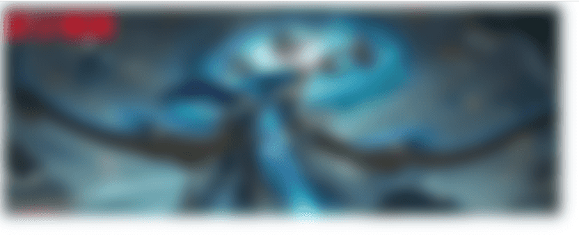
这里要注意的一点是,添加模糊后,实际的大小会超出我们设置的宽高,因为周围的毛边效果,你可以在外面包一层并设置 overflow: hidden;
filter例二
1 2 3 4 5 6 7 8 9 10 11 12 13 14 15 16 17 18 19 20 21 22 23 24 25 26 27 28 | .wrapBox2 { width: 800px; height: 300px; /* overflow: hidden; */ position: relative; } .subBox { width: 100%; height: 100%; position: absolute; width: calc(100% - 100px); height: calc(100% - 100px); z-index: 2; filter: blur(10px); } .text { position: relative; /* z-index: 10; */ font-size: 40px; font-weight: bold; color: #f00; }<div class="wrapBox2"> <img decoding="async" src="./win.jpeg" class="subBox"><div class="text">全部模糊</div></div> |
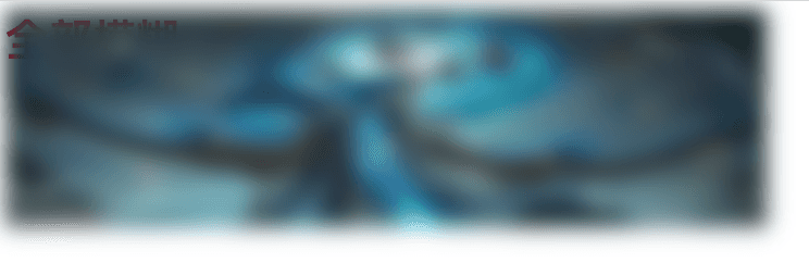
这种方式的话,文字和图片由于是平级的,所以文字要么在图片下方,要么在上方(根据z-index来控制),而不会对文字进行模糊。
backdrop-filter例一
1 2 3 4 5 6 7 8 9 10 11 12 13 14 15 16 17 18 19 20 21 22 23 24 25 26 27 28 29 30 31 | .wrapBox2 { width: 800px; height: 300px; overflow: hidden; position: relative; background-image: url("./win.jpeg"); background-size: 100% 100%; background-repeat: no-repeat; } .subBox { position: absolute; width: calc(100% - 100px); height: calc(100% - 100px); z-index: 2; backdrop-filter: blur(10px); /* top: 100px; */ } .text { position: relative; /* z-index: 10; */ font-size: 40px; font-weight: bold; color: #f00; }<div class="wrapBox2"> <div class="subBox"></div> <div class="text">部分模糊</div></div> |
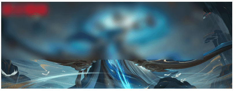
可以看到,backdrop-filter 属性不必设置在一个图片元素上面,而是任何元素上面就行,这种方式我觉得更加灵活
总结
- 如果只是模糊一张图片,那么直接用 filter 就可以实现。
- 如果想要用一个模糊蒙层盖住html页面/图片的某一部分,那么使用 backdrop-filter。
当然,使用 backdrop-filter 也可以满足第一种场景。
到此这篇关于CSS使用filter和backdrop-filter实现高斯模糊效果(示例代码)的文章就介绍到这了,更多相关css高斯模糊内容请搜索IT俱乐部以前的文章或继续浏览下面的相关文章,希望大家以后多多支持IT俱乐部!

