
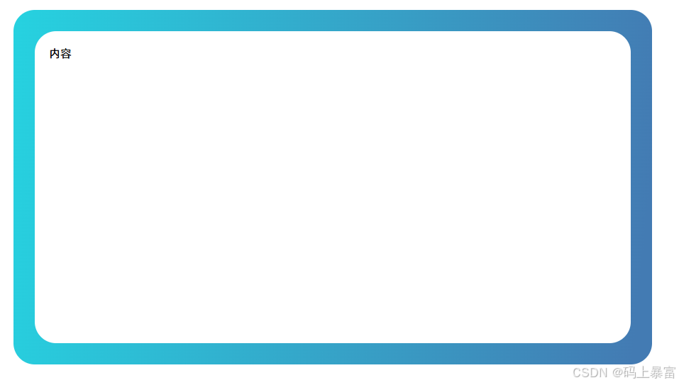
渐变色圆角边框(内容区域圆角)
1 2 3 4 5 6 7 8 9 10 11 12 13 14 15 16 17 18 19 20 21 22 | <title>渐变色圆角边框(内容区域圆角)</title> #container { width: 800px; height: 400px; border-radius: 30px; background-color: white; position: relative; padding: 20px; margin: 50px; } #container::before { content: ''; position: absolute; top: -30px; right: -30px; bottom: -30px; left: -30px; border-radius: inherit; background: linear-gradient(96deg, #26d2e0 0%, #437bb3 97%); z-index: -1; }<div id="container">内容</div> |
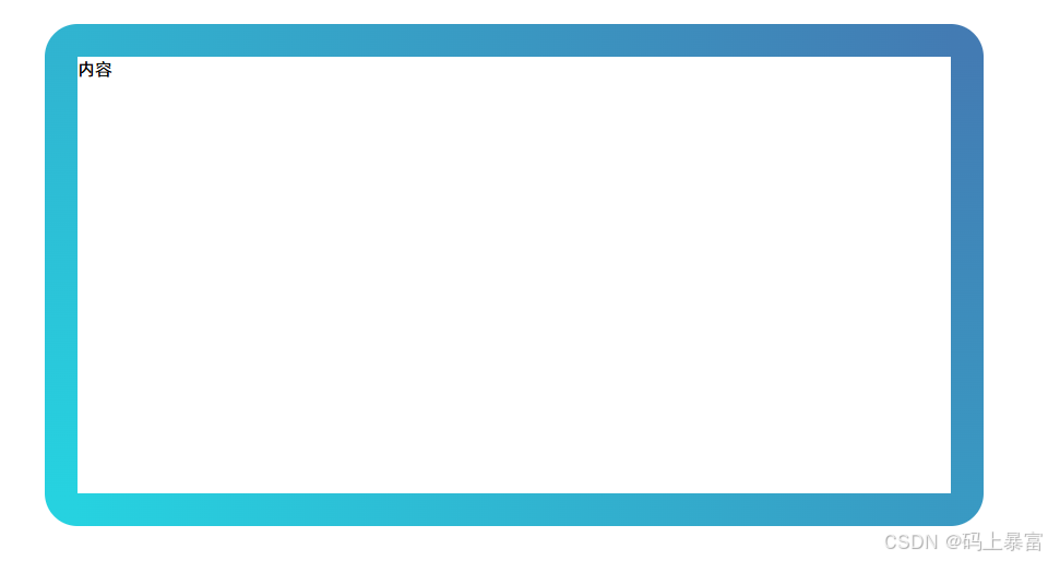
渐变色圆角边框(内容区域直角)
1 2 3 4 5 6 7 8 9 10 11 | <title>渐变色圆角边框(内容区域直角)</title> #container { position: relative; width: 800px; height: 400px; border: 30px solid; border-image: linear-gradient(45deg, #26d2e0, #437bb3) 1; clip-path: inset(0 round 30px); margin: 50px; }<div id="container">内容</div> |
到此这篇关于css实现渐变色圆角边框的文章就介绍到这了,更多相关css渐变色圆角边框内容请搜索IT俱乐部以前的文章或继续浏览下面的相关文章,希望大家以后多多支持IT俱乐部!

