
本文主要介绍了纯html+css实现打字效果,具有一定的参考价值,感兴趣的可以了解一下
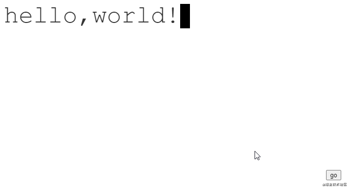
效果图
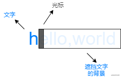
分析
可以将动画看做三个不同的层次:
- 最底层的文字
- 中间挡住文字的背景
- 最上层的光标
文字是静止的,而中间的背景和最上层的光标是动态的。
初始时,背景挡住所有的文字,光标在最左边。
动画进行时,背景和光标以相同的步伐从左往右移动。
动画结束时,背景不再遮挡文字,光标则在最右边闪烁。
代码
html
1 | <div class="text">hello,world!</div> |
css
1 2 3 4 5 6 7 8 9 10 11 12 13 14 15 16 17 18 19 20 21 22 23 24 25 26 27 28 29 30 31 32 33 34 35 36 37 38 39 40 41 42 43 44 45 46 47 48 49 50 51 52 53 54 55 56 57 58 59 60 61 62 63 64 65 66 67 68 69 70 71 72 73 | :root { /* 字符数量 */ --steps: 12; /* 动画时间 */ --duration: 2.5s; /* 字体大小 */ --fontSize: 50px; /* 光标大小 */ --cursorSize: 20px;}.text { color: #333;; position: relative; display: inline-block; font-family: 'Courier New', Courier, monospace; font-size: var(--fontSize); line-height: 1;}.text::after { content: ''; width: var(--cursorSize); height: var(--fontSize); background-color: black; z-index: 2; position: absolute; animation: blink 1s var(--duration) step-end infinite, moveCursor var(--duration) steps(var(--steps)) forwards;}.text::before { content: ''; width: 100%; height: var(--fontSize); z-index: 1; position: absolute; background: linear-gradient(#fff, #fff) no-repeat top right; animation: showText var(--duration) steps(var(--steps)) forwards;}/* 光标闪烁动画 */@keyframes blink { 0% { background-color: black; } 50% { background-color: transparent; } 100% { background-color: black; }}/* 光标移动动画 */@keyframes moveCursor { 0% { left: 0%; } 100% { left: 100%; }}/* 背景移动动画 */@keyframes showText { 0% { background-size: 100% 100%; } 100% { background-size: 0% 100%; }} |
注意
字体必须是等宽字体。因为光标每次移动的距离是是根据字符的数量 / 总宽度来决定的。
到此这篇关于纯html+css实现打字效果的文章就介绍到这了,更多相关html css打字效果内容请搜索IT俱乐部以前的文章或继续浏览下面的相关文章,希望大家以后多多支持IT俱乐部!

