
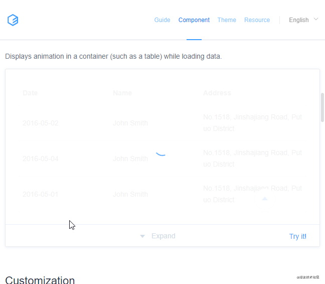
这是 Element UI loading 组件的效果图,看起来很酷,我们来实现一下!
分析
动画由两部分组成:
蓝色的弧线由点伸展成一个圆,又从圆收缩成一个点。
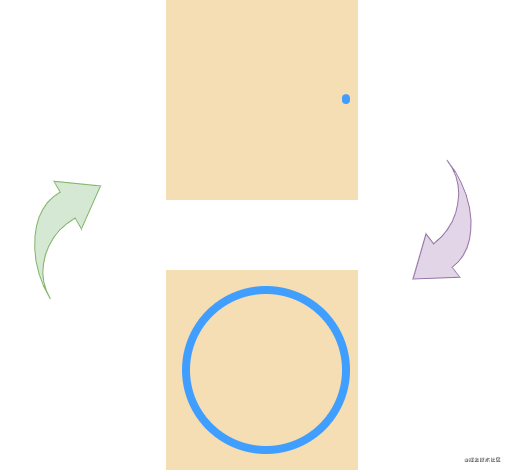
圆的父节点带着圆旋转
代码
html
1 | <svg viewBox="25 25 50 50" class="box"><circle cx="50" cy="50" r="20" fill="none" class="circle"></circle></svg> |
css
默认样式
1 2 3 4 5 6 7 8 9 10 | .box { height: 200px; width: 200px; background: wheat;}.box .circle { stroke-width: 2; stroke: #409eff; stroke-linecap: round;} |
添加动画效果
1 2 3 4 5 6 7 8 9 10 11 12 13 14 15 16 17 18 19 20 21 22 23 24 25 26 27 28 29 30 31 32 33 | /* 旋转动画 */@keyframes rotate { to { transform: rotate(1turn) }}/* 弧线动画 *//* 125 是圆的周长 */@keyframes circle { 0% { /* 状态1: 点 */ stroke-dasharray: 1 125; stroke-dashoffset: 0; } 50% { /* 状态2: 圆 */ stroke-dasharray: 120, 125; stroke-dashoffset: 0; } to { /* 状态3: 点(向旋转的方向收缩) */ stroke-dasharray: 120 125; stroke-dashoffset: -125px; }}.box { /* ...同上 */ animation: rotate 2s linear infinite;}.circle { /* ...同上 */ animation: circle 2s infinite;} |
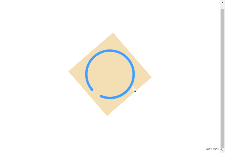
最后把背景去掉
在线代码演示 https://jsbin.com/yarufoy/edit?html,css,output
到此这篇关于纯html+css实现Element loading效果的文章就介绍到这了,更多相关html+css实现 loading内容请搜索IT俱乐部以前的文章或继续浏览下面的相关文章,希望大家以后多多支持IT俱乐部!

